The folk art of national identity
Growing up in Maine, the Canadian flag was a common sight — especially in the summertime, when the nearby town of Old Orchard Beach turned into a Québécois Saint-Tropez.
So I was surprised to learn that the Canadian national icon — its maple leaf flag — is a relatively recent invention, and the subject of bitter debate when it was proposed in the Canadian parliament in 1964.
 Canada's old flag featured the Union Jack symbol, which was a a snub to French Quebec. In the mid-1960s, when the Québécois separatist movement began to organize, Prime Minister Lester B. Pearson proposed a new national flag that could shore up the nation's unity and give it its own post-colonial identity.
This may not actually have been a productive political gambit. "Quebec does not give a tinkers dam about the new flag," said Liberal politician Pierre Trudeau (Trudeau himself would go on to become a Canadian icon in his own right as one of the nation's most successful and beloved Prime Ministers, mainly for moving the country beyond its British roots and championing a bilingual, multiethnic Canadian identity).
Fortunately, though, the rest of Canada did care about the flag. They mailed in thousands of suggestions in pen-and-ink drawings and watercolor paintings. Beavers, maple leaves, fleurs-de-lis, or the old Union Jack were common themes. Some of the public's suggestions have been digitized on this website from the University of Saskatchewan, and they're pretty amazing examples of Canadian folk art at a time when the adjective "Canadian" was actually beginning to mean something. Each one is a snapshot of a nation that's still trying to figure itself out.
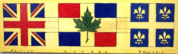
 A British-French mashup.

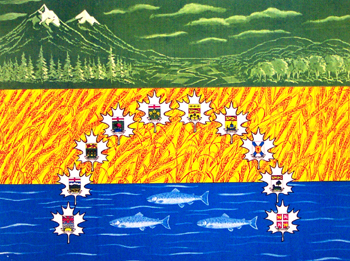
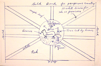
From Manitoba, April 1963:
"The top green strip portrays in the background the Rocky Mountains of the West and the Laurentians of the East....The second strip of yellow gold depicts the growing grain for which Canada is famous...The third strip describes untold numbers of rivers and thousands of lakes...the Atlantic, the Pacific and the Arctic....The coats of arms of the ten provinces which make up Canada are in the shape of an arc and depicts its beginning and origin. Even the shape of the arc has a meaning - freedom, better life and individualism for all those who want to make Canada their new country."
 I feel like lots of designs resemble hockey jerseys. From Alberta, 1964:
"Through the Maple Leaf, this flag represents Canada as always being in "the peerpetual light." A light shining over one Canada. People's choice #1."
 From Ontario, 22 May 1964:
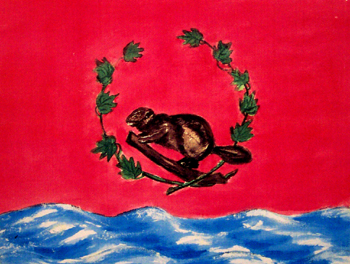
"If we must have a new flag, it should be one to be proud of, that will bring unity to this wonderful country of ours....The ten maple leaves, for ten provinces. The Canadian Beaver, and waves are for 'from sea to sea.'"
 Quite a few didn't get the memo about how the Union Jack is faux pas in Quebec (submission from New Brunswick, 30 November 1964).
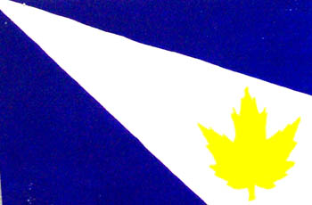
 Canada rejected this one, but Idaho picked it out of the garbage and adopted it as its own state flag in 1967.
In the end, Canada avoided old-world heraldry altogether and went with a clean and strikingly modern design. Neither French nor English, the new Canadian flag was one of several mid-century innovations that helped the nation clear out its colonial baggage and define itself on its own terms.
Hat tip to Burrito Justice for finding these and writing about them in his post about funny animals as national symbols.
So I was surprised to learn that the Canadian national icon — its maple leaf flag — is a relatively recent invention, and the subject of bitter debate when it was proposed in the Canadian parliament in 1964.
 Canada's old flag featured the Union Jack symbol, which was a a snub to French Quebec. In the mid-1960s, when the Québécois separatist movement began to organize, Prime Minister Lester B. Pearson proposed a new national flag that could shore up the nation's unity and give it its own post-colonial identity.
This may not actually have been a productive political gambit. "Quebec does not give a tinkers dam about the new flag," said Liberal politician Pierre Trudeau (Trudeau himself would go on to become a Canadian icon in his own right as one of the nation's most successful and beloved Prime Ministers, mainly for moving the country beyond its British roots and championing a bilingual, multiethnic Canadian identity).
Fortunately, though, the rest of Canada did care about the flag. They mailed in thousands of suggestions in pen-and-ink drawings and watercolor paintings. Beavers, maple leaves, fleurs-de-lis, or the old Union Jack were common themes. Some of the public's suggestions have been digitized on this website from the University of Saskatchewan, and they're pretty amazing examples of Canadian folk art at a time when the adjective "Canadian" was actually beginning to mean something. Each one is a snapshot of a nation that's still trying to figure itself out.
From Manitoba, April 1963:
"The top green strip portrays in the background the Rocky Mountains of the West and the Laurentians of the East....The second strip of yellow gold depicts the growing grain for which Canada is famous...The third strip describes untold numbers of rivers and thousands of lakes...the Atlantic, the Pacific and the Arctic....The coats of arms of the ten provinces which make up Canada are in the shape of an arc and depicts its beginning and origin. Even the shape of the arc has a meaning - freedom, better life and individualism for all those who want to make Canada their new country."
 I feel like lots of designs resemble hockey jerseys. From Alberta, 1964:
"Through the Maple Leaf, this flag represents Canada as always being in "the peerpetual light." A light shining over one Canada. People's choice #1."
"If we must have a new flag, it should be one to be proud of, that will bring unity to this wonderful country of ours....The ten maple leaves, for ten provinces. The Canadian Beaver, and waves are for 'from sea to sea.'"
 Quite a few didn't get the memo about how the Union Jack is faux pas in Quebec (submission from New Brunswick, 30 November 1964).
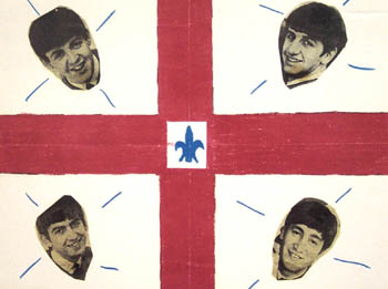
In the end, Canada avoided old-world heraldry altogether and went with a clean and strikingly modern design. Neither French nor English, the new Canadian flag was one of several mid-century innovations that helped the nation clear out its colonial baggage and define itself on its own terms.
Hat tip to Burrito Justice for finding these and writing about them in his post about funny animals as national symbols.