I We Love This Building
UPDATE 6/13: Portland voters rejected the proposal to move the Library by a comfortable 56% to 44% margin. Thanks to all of you who voted or provided free publicity to our scrappy opposition campaign.
Portlanders have a reputation for architectural conservatism: it's a rare building that goes up downtown without a faux-historical coating of red brick. I suspect that this is one reason that the central library's brash modernist architecture doesn't receive the respect it deserves.

But I love this building. The gravity-defying front entrance (above) creates a quiet, shady courtyard that both expands the public space of Monument Square and provides a calming refuge from the bustle of the city center.
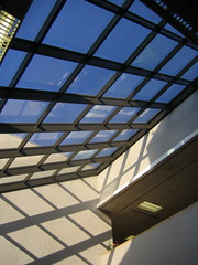
 Inside, a skylit ramp leads to the circulation desk and the amply daylighted collections of new books and current magazines. Keep in mind that while this building may have been built before the "green" architecture fad, it was built during a serious energy crisis, and the architecture responds with ample daylight and elements of passive solar design.
 I'm especially fond of the side of the building along Elm Street. Metro riders are familiar with this facade and the thoughtful clock that complements the bus schedules posted at the Elm Street transit center. The building mirrors the climbing topography of the street, and a series of one-story "steps" makes the transition from the low-rise neighborhood around Cumberland Avenue to the monumental architecture of Monument Square in the space of one block. From the sidewalk, the long, low main level looks like a delicate counterweight that balances the jumble of higher stories massed near Monument Square:

To be sure, the interior of the Library needs to be updated: how we use libraries has changed dramatically since this building opened in 1979. But the overall structure of the building continues to serve the Library's public education mission remarkably well in spite of its age, and I believe that the generous interactions between the public library and the public square in front of it are a tremendous credit to the building's success.
Now, the old public market building is also nice. But it wasn't designed to be a library: in order to fit in the necessary stacks, desks, and office space, the library's trustees plan to block views of the dramatic post-and-beam ceiling with a second floor in between the ground level and the roof. The renovated market would lose much of its architectural appeal, and at 3/4 the size of the current library, it's going to be cramped to boot.
On a more pragmatic note, the relocation plan would spend millions of dollars in public and private foundation money that would be better spent on things like books, computers, librarians, and educational programs.
The election that will determine this building's fate will be held tomorrow. Vote, please. And if you don't live in Portland, Maine, come and visit our awesome library sometime.
Look at more photos of our library here.


1 comment:
Success!
I hope the renovation opens more of the second and third floors to public space--a reading room, perhaps. Some of the best light and space is kept for the staff and off-limits to the public. And much could be done to improve the Portland Room's collection setting.
And let me take this opportunity to praise the research librarians at the library. They're great and they'll bend over backwards to help you out--it's like having your own research staff.
Here's to our old 'new' building!
Post a Comment